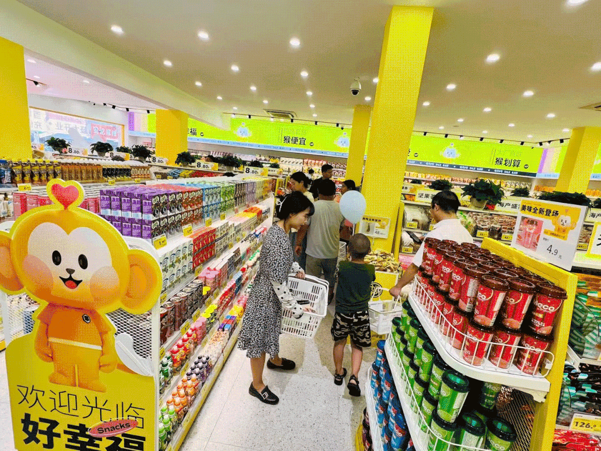
Offline hundred stores
Chain snack brand
-
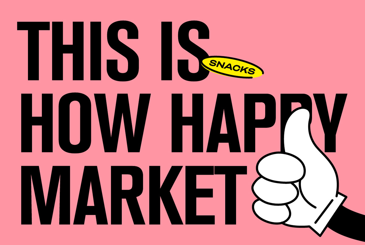
HOW HAPPY is an offline chain brand mainly selling all kinds of snacks, with 22 years of purchasing and operating experience in the food retail industry. HOW HAPPY has been adhering to the mining of new products, and strict control of products, to provide rich and value-for-money products, hope that consumers from good happiness away not only snacks, but also bags of happiness.
Chain snack brand
-
HOW HAPPY is an offline chain brand mainly selling all kinds of snacks, with 22 years of purchasing and operating experience in the food retail industry. HOW HAPPY has been adhering to the mining of new products, and strict control of products, to provide rich and value-for-money products, hope that consumers from good happiness away not only snacks, but also bags of happiness.
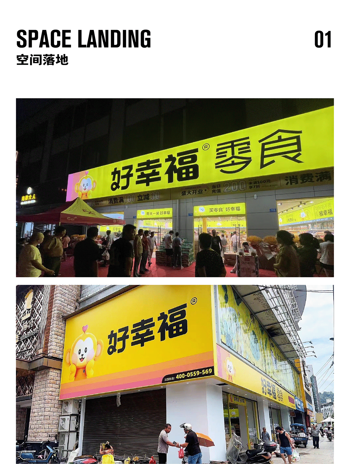
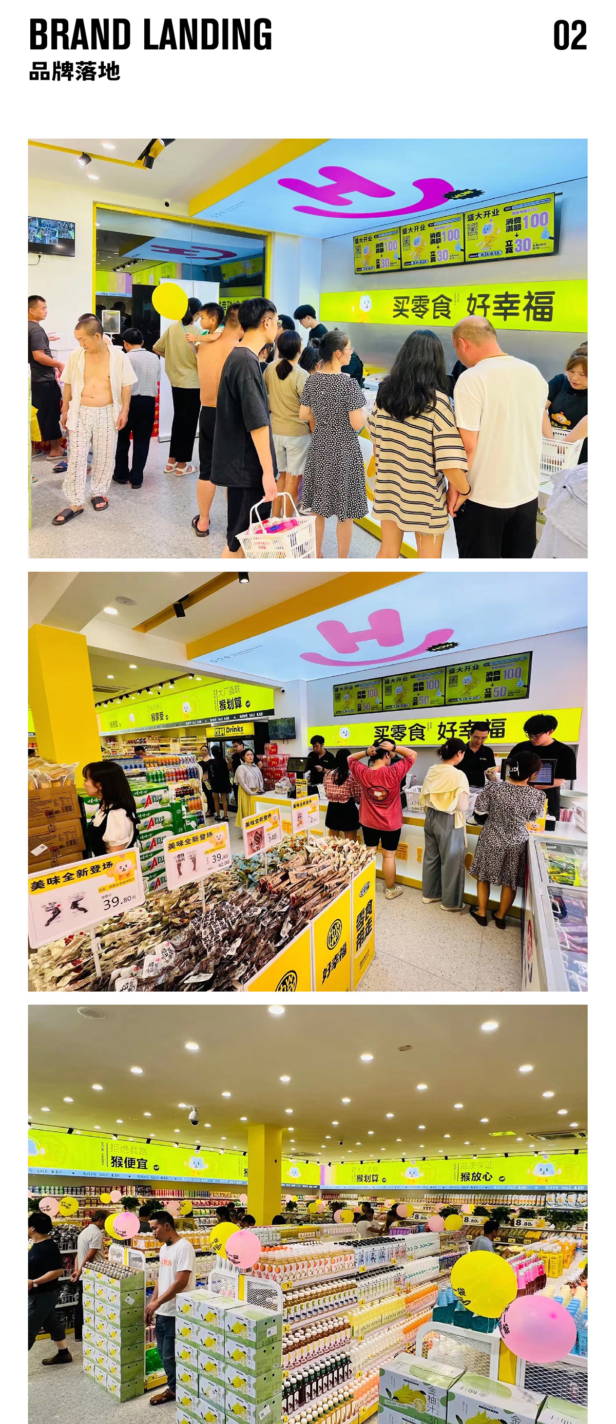
线下百店
连锁零食品牌
-
好幸福是一家以售卖各类零食为主的线下量贩式连锁品牌,拥有食品零售行业22年的采购与运作经验。好幸福一直坚持挖掘新品,并严格控品,提供丰富且物超所值的产品,希望消费者从好幸福带走的不只是零食,更是一袋袋的幸福。
连锁零食品牌
-
好幸福是一家以售卖各类零食为主的线下量贩式连锁品牌,拥有食品零售行业22年的采购与运作经验。好幸福一直坚持挖掘新品,并严格控品,提供丰富且物超所值的产品,希望消费者从好幸福带走的不只是零食,更是一袋袋的幸福。
Symbol source:
It's a monkey and a snack box
-
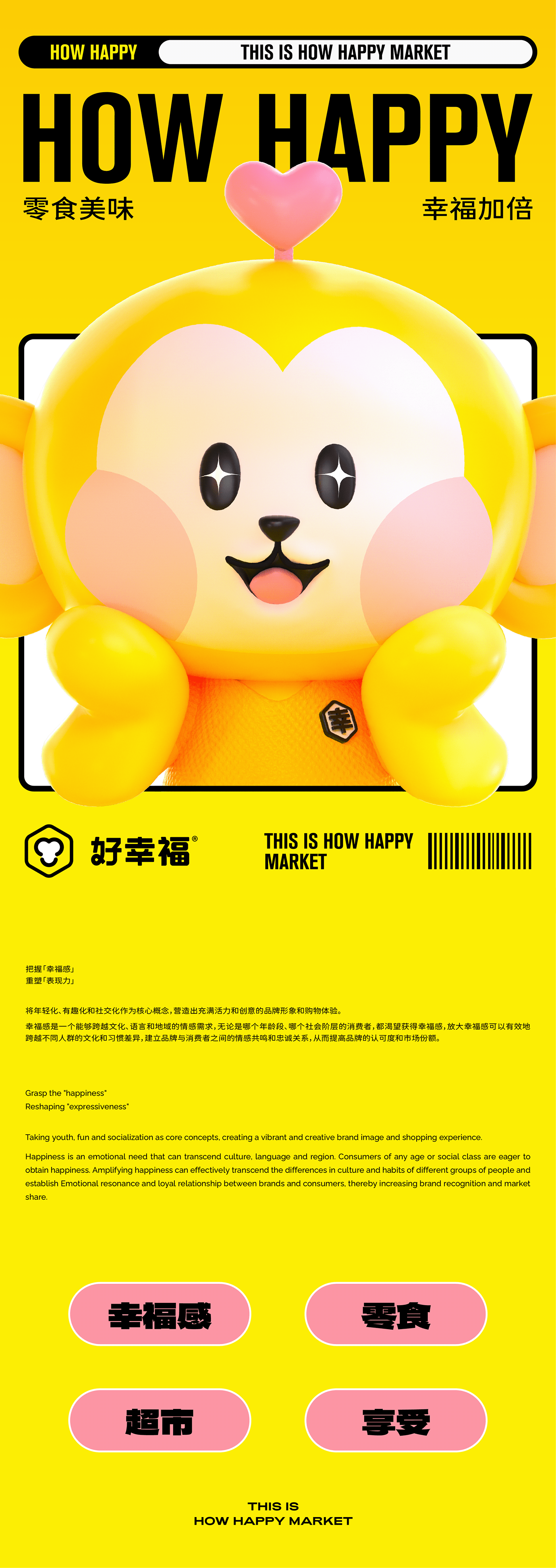
The Cantonese pronunciation of "good" is a homonym with "monkey", which we use as an interesting association and use monkey as its brand gene. In the symbolic design, we gathered the three concepts of "love", "smile" and "space", and obtained a simple "monkey" symbol by using simple lines and colors, which means that HOW HAPPY is not only a snack treasure box, but also a transmitter of happiness.
It's a monkey and a snack box
-
The Cantonese pronunciation of "good" is a homonym with "monkey", which we use as an interesting association and use monkey as its brand gene. In the symbolic design, we gathered the three concepts of "love", "smile" and "space", and obtained a simple "monkey" symbol by using simple lines and colors, which means that HOW HAPPY is not only a snack treasure box, but also a transmitter of happiness.
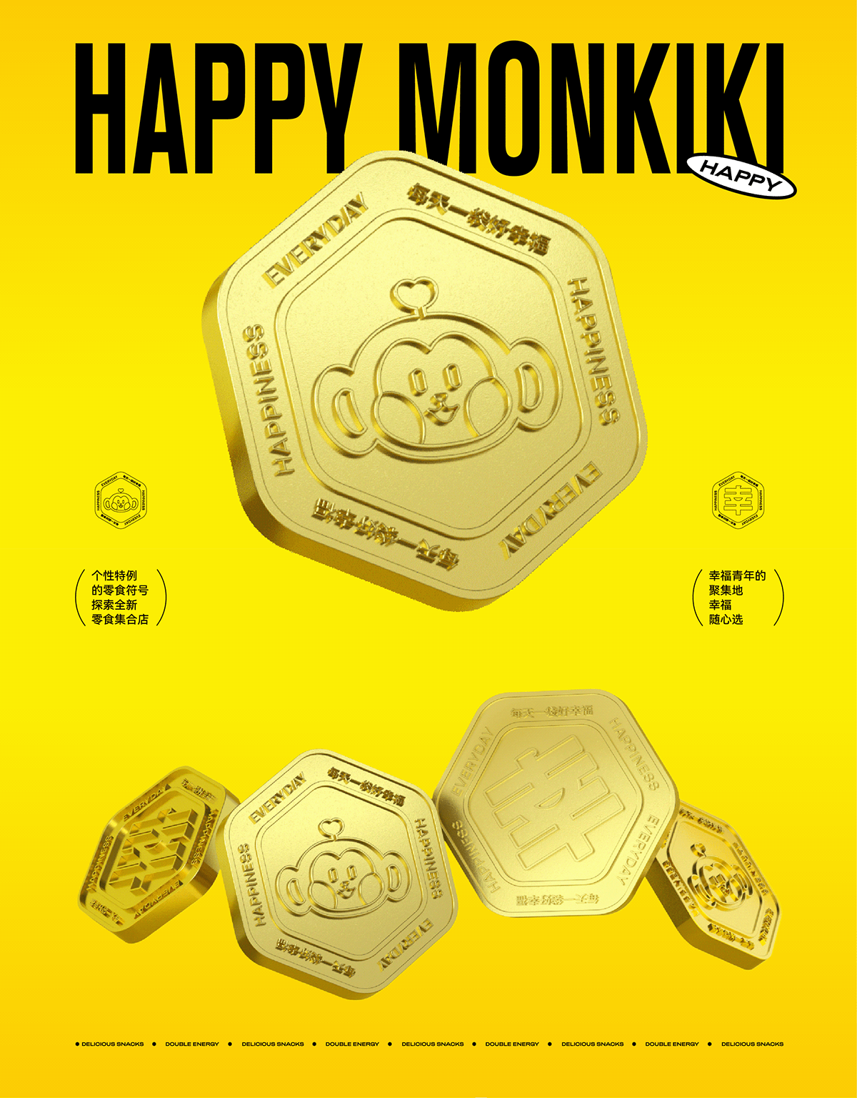
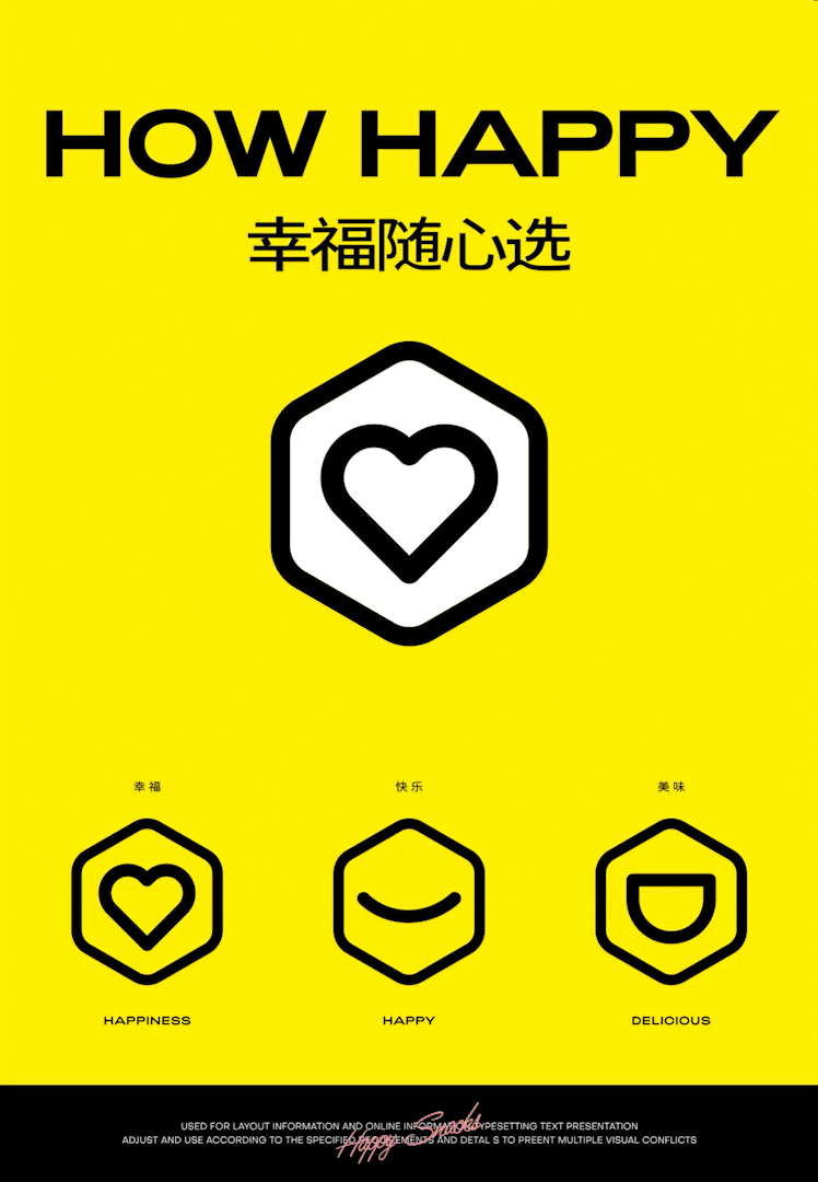
符号来源:
是猴,也是零食百宝箱
-
“好”的粤语发音与“猴”同音,我们以此作为趣味联想,将猴作为其品牌基因。在符号设计上,我们集合“爱心”、“微笑”和“空间”三个理念,利用简单的线条勾勒以及色彩描绘,得到了一个简洁的“猴”符号,寓意着好幸福不仅是零食百宝箱,也是幸福感的传递者。
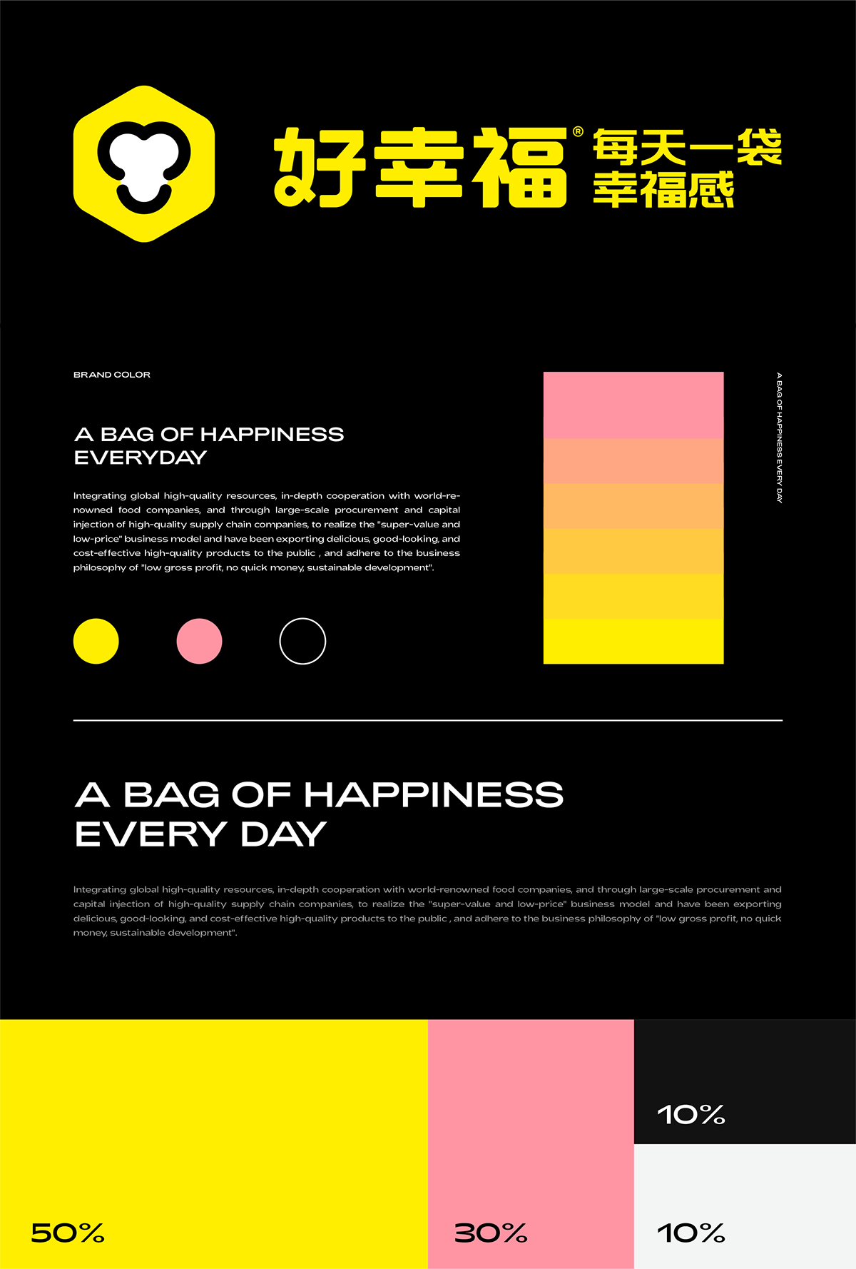
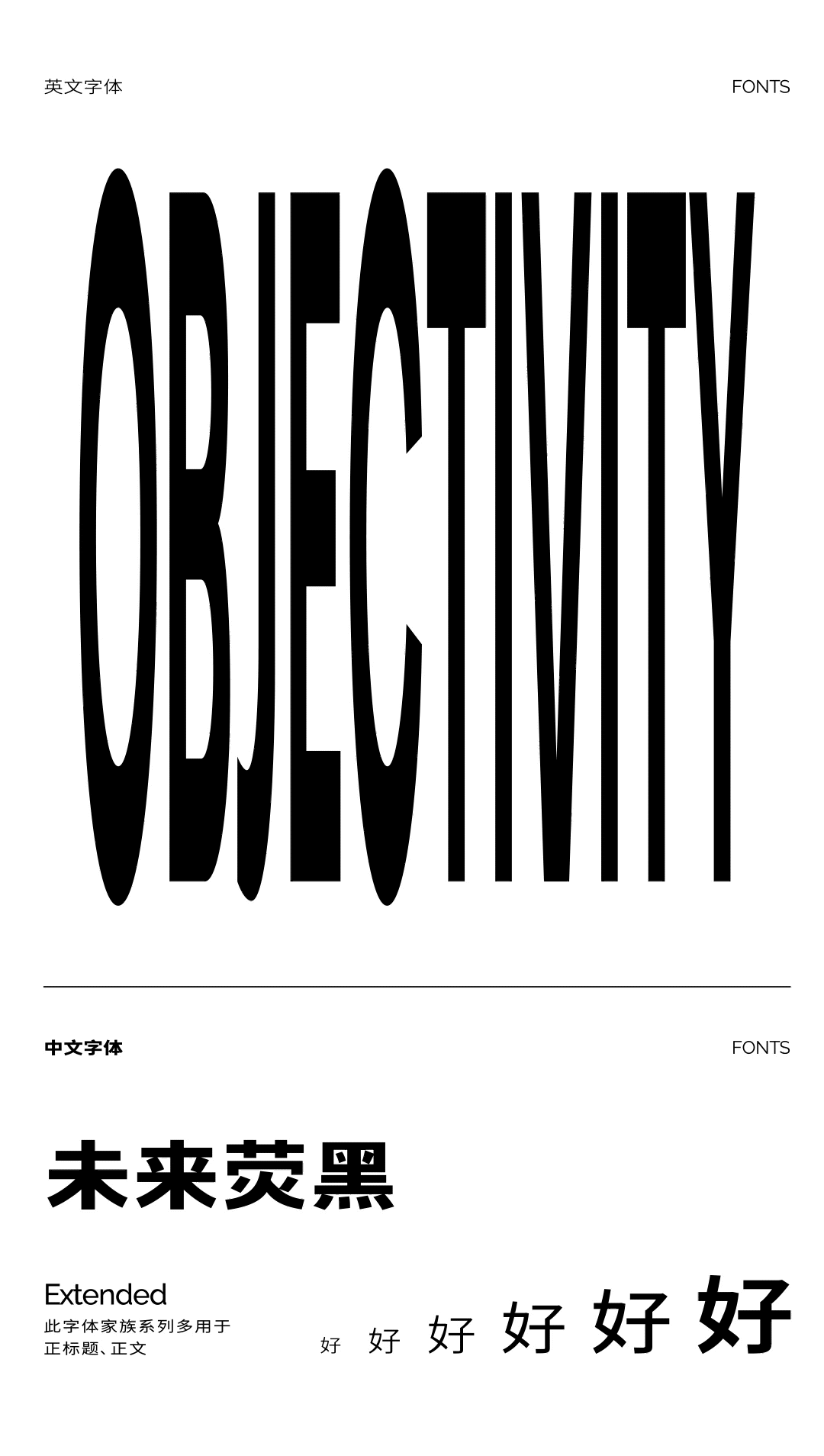
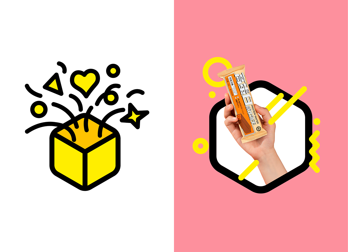
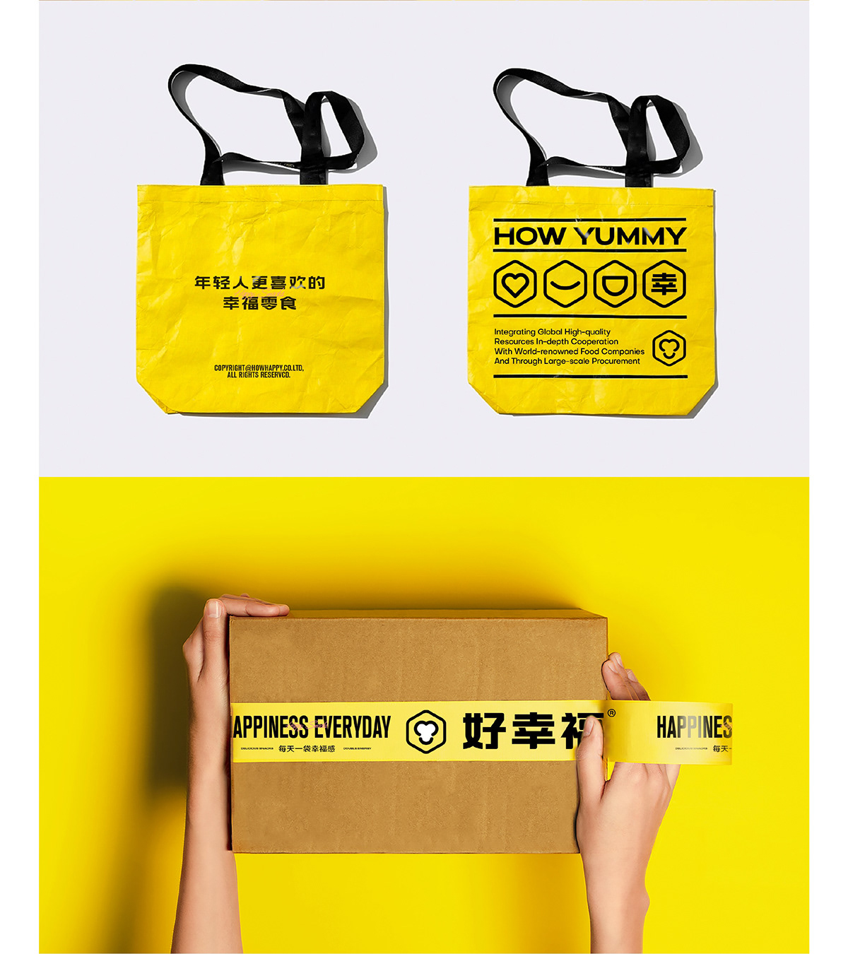
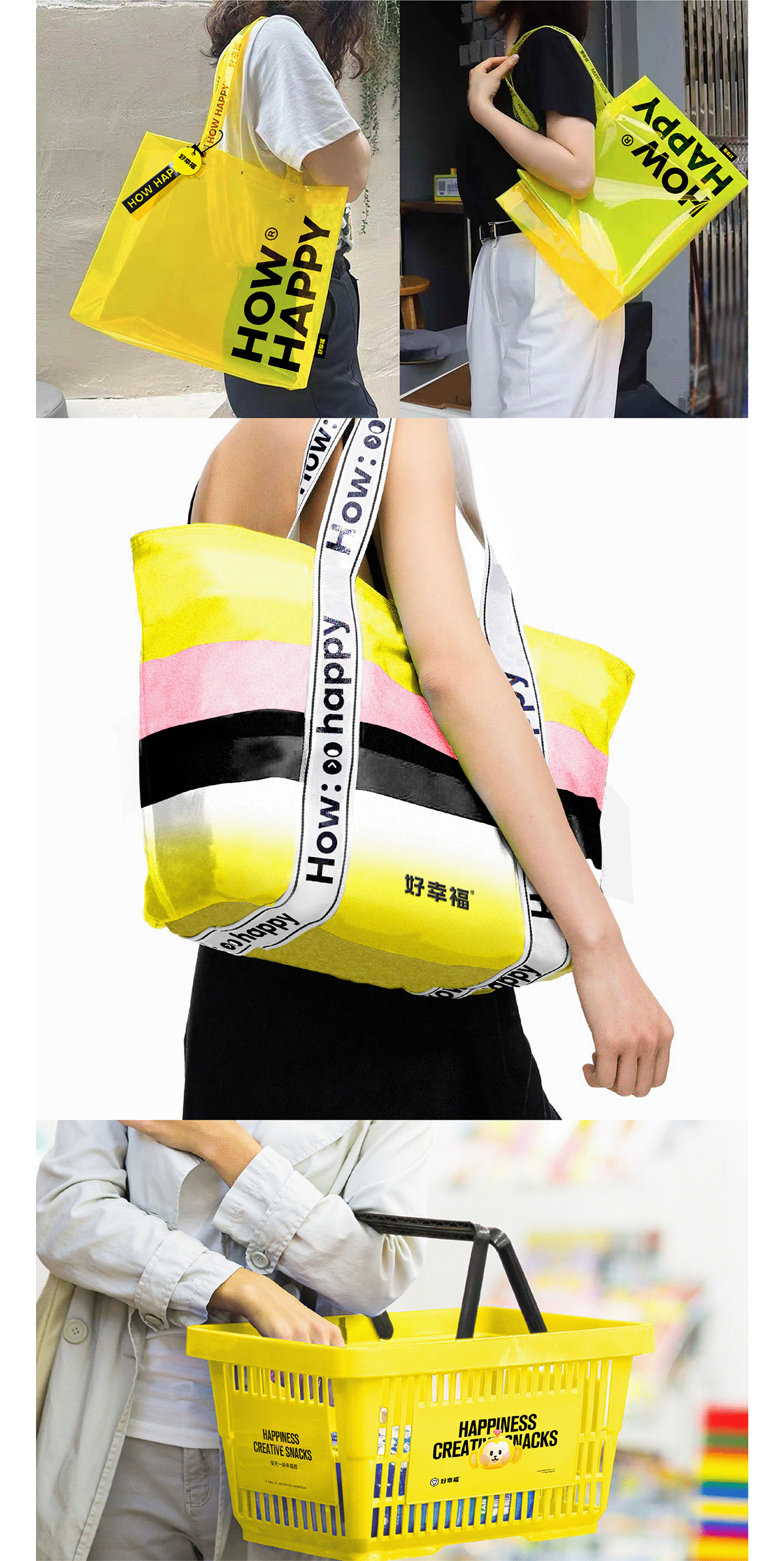
By font and color
Create a visual image of the people
-
Based on the thinking of the industry and the audience, we believe that the focus of brand design is to create a sense of closeness and convey the concept of happiness. In font design, round and smooth lines instead of straight lines make the brand more accessible. In terms of color, we chose bright yellow as the main color of the brand, supplemented by warm pink, forming an interesting gradient, which is a feeling of happiness, warm and positive.
通过字体与色彩
塑造亲民的视觉形象
-
基于对于行业以及受众群体的思考,我们认为品牌设计的重点在于塑造亲民感,传递幸福这一概念。在字体设计上,圆润顺滑的线条代替直线,让品牌更易接近。在色彩上,我们选择明亮的黄色作为品牌主色,辅以暖调的粉色,形成有趣的渐变,是幸福的感觉,温暖而积极。

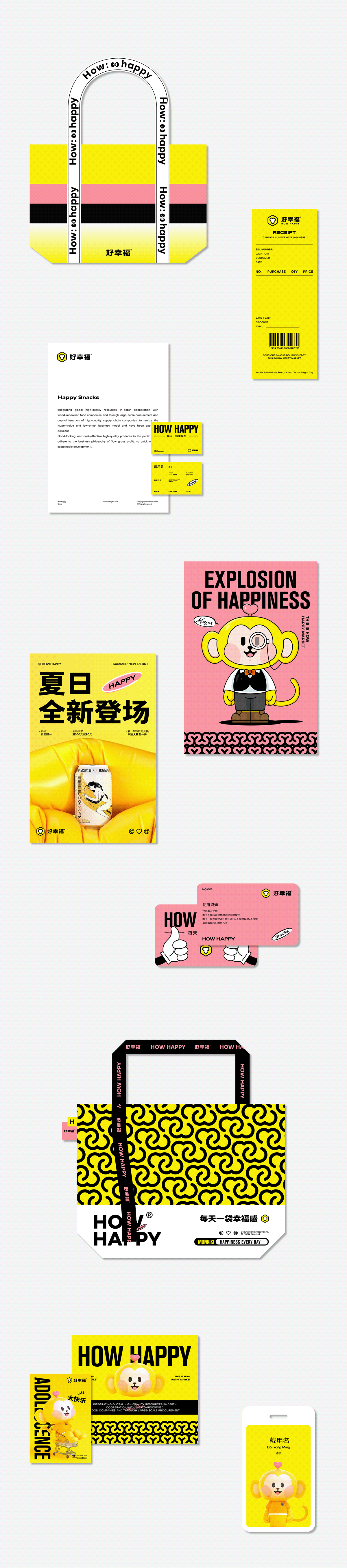


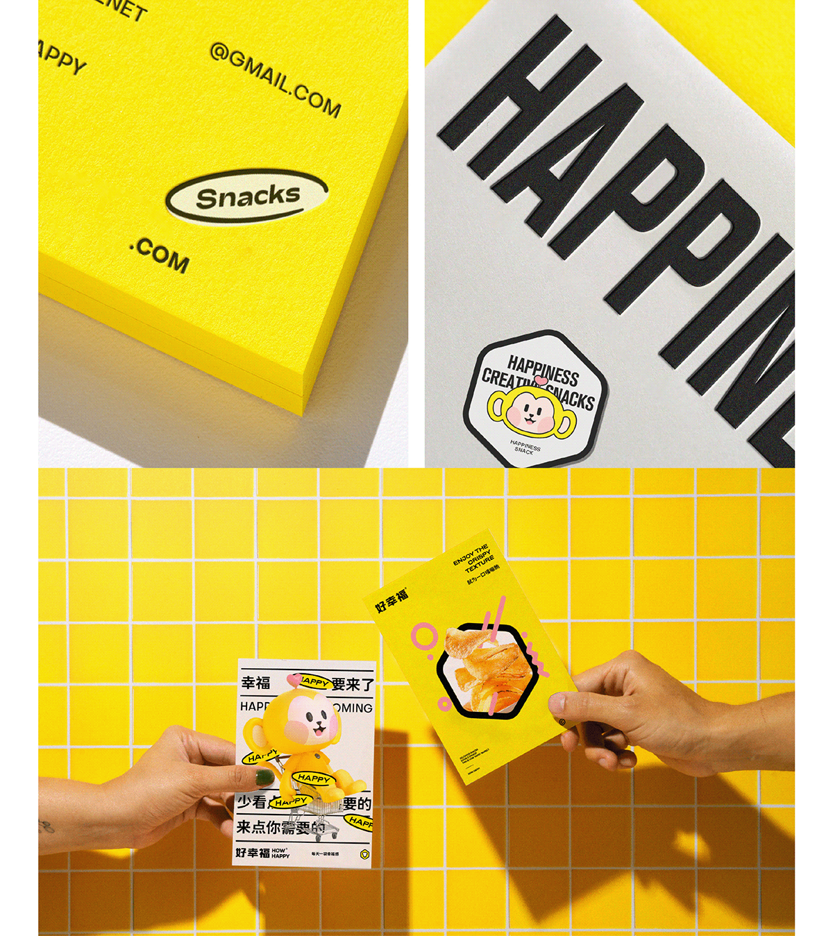

Use creative and interesting expressions
Create affinity super IP
-
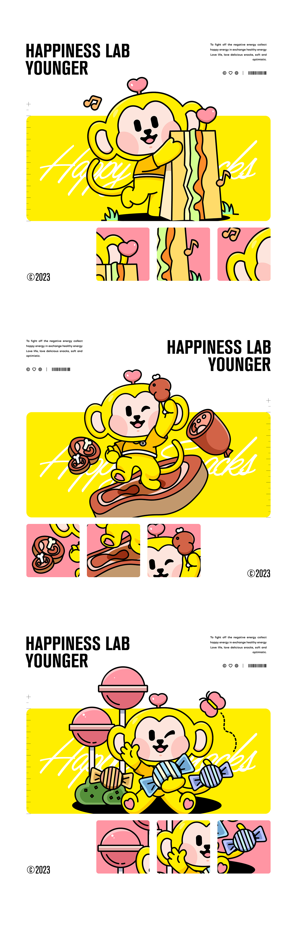
From the role prototype, to the character design, and then to the memory characteristics, to create a brand IP image that young customers love, the affinity of the image is very important. A popular IP image will continue to add potential energy to the brand.
Create affinity super IP
-
From the role prototype, to the character design, and then to the memory characteristics, to create a brand IP image that young customers love, the affinity of the image is very important. A popular IP image will continue to add potential energy to the brand.
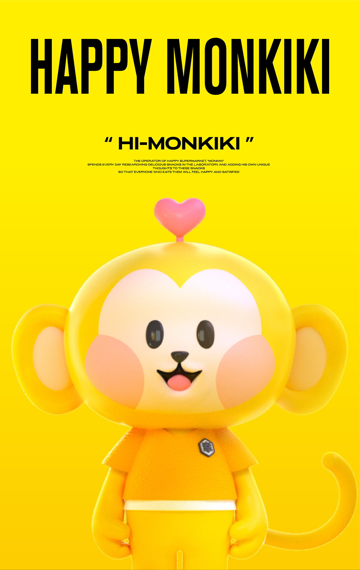
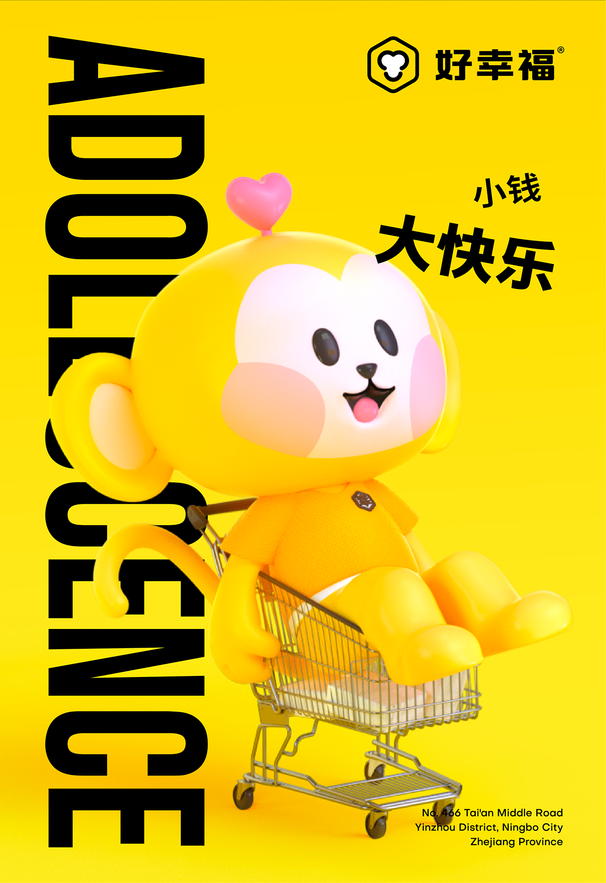
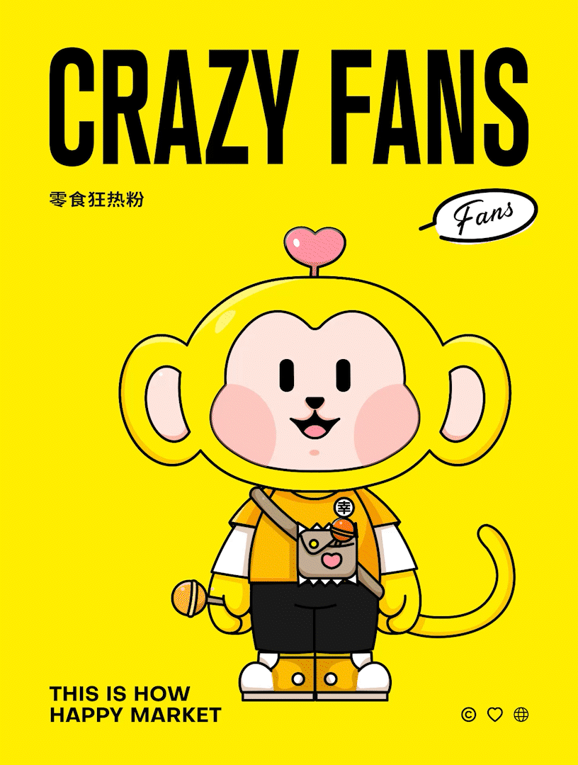
We shaped the IP - "Hou Houqi", homophonic "good taste", is the expression of creative interest, but also easy to be remembered. In addition to the name, the lovely appearance, the love on the head, the "lucky" badge on the chest, these are also the characteristics of memory, representing a good experience and service, and have affinity, narrowing the distance between the brand and people!
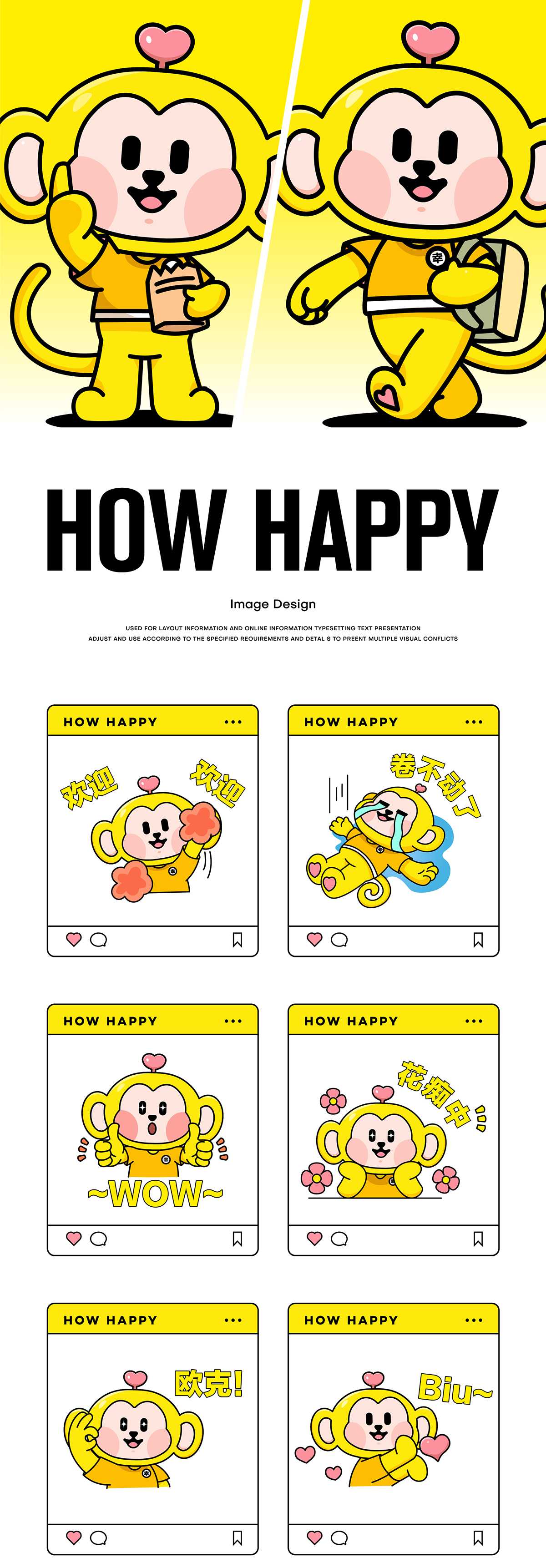
用创意趣味的表达
塑造亲和力超级IP
-
从角色原型、到性格人设、再到记忆特征,塑造一个年轻客群喜爱的品牌IP形象,形象的亲和力是非常重要的。一个受大众欢迎的IP形象,将持续不断地为品牌增加势能。
我们塑造了IP——“猴猴七”,谐音“好好吃”,是创意趣味的表达,也是易被记忆的。除了名字外,可爱的外观、头顶的爱心、胸前的“幸”徽章,这些也都是记忆的特征点,代表着好的体验与服务,并具有亲和力,拉近品牌与人的距离感!